Solo Mining
Delving into the exciting new mining features introduced in solo apps!
Exploring the Mining features of Solo Apps
The mining page in solo apps introduces new widgets for data analysis and visualization. These widgets offer a comprehensive view of app performance, allowing you to identify bottlenecks, track user behavior, and optimize their flows for better efficiency and user experience.
On navigating to the mining page, you will notice two distinct tabs: "Assisted" and "Solo"
Let's switch to solo apps.
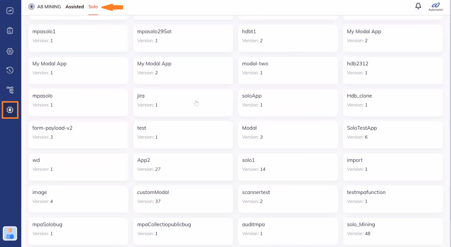
Upon selecting the "Solo" tab, you will observe a slight difference in the interface compared to assisted apps. Notably, the KPI (Key Performance Indicator) metrics are no longer displayed directly on the page. Instead, these metrics have been incorporated into the "Widgets" section, where we will show the KPI metrics for each individual flow, rather than the entire app. This change has been implemented to accommodate the solo apps' characteristics of containing multiple flows.
Within this interface, you will find the app listed along with its associated flows (to gain a deeper understanding of the app's structure, you can look at the journey in Studio Web). By default, the initial flow of the app is selected, along with the latest version. However, you have the flexibility to switch between different flows and versions, enabling you to explore and analyze specific configurations.
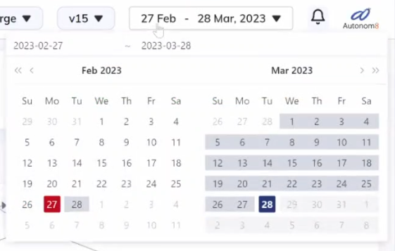
In general, on the widgets page, the default is to show data for the last 30 days. However, you can configure this and change the range using the range picker. So, by default, it will display data for the last 30 days.
Widgets: Enhanced Data Visualization
The Widgets section offers a diverse range of powerful tools for data analysis and visualization. In this session, we will focus on the key widgets: Heatmap, Active Sessions, Dominant Path, Top APIs, Top Domains, APIs by Status Code, and User Performance.
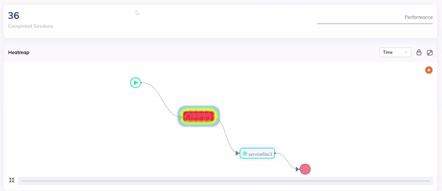
Heatmap Widget: Visualizing Node Performance
The Heatmap widget provides a comprehensive visual representation of nodes within a flow, allowing you to assess their performance and completion times. Nodes are color-coded based on completion time, with red indicating longer completion times, followed by yellow, green, and blue.
- Red (Longest)
- Yellow
- Green
- Blue (Shortest)
By default, the Heatmap widget displays data based on completion time. We have a node called "recharge failure" colored in red, indicating it took the longest time to complete compared to other nodes. Then we have green nodes like "view plans" and "payment details," which took less time. The heatmap provides a visual representation of this data.
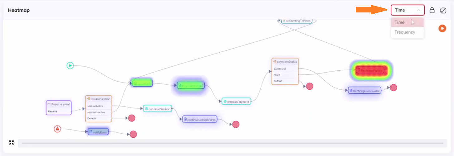
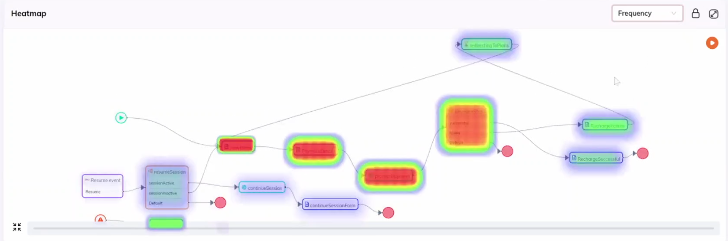
However, it also offers the flexibility to configure the display based on frequency, which highlights the number of hits or traffic received by each node.
The heatmap widget also includes a play area. By hovering over the progress bar, you can select a specific day to view the data. For example, if we select March 5, the data displayed will correspond to that specific day. You can play through different dates to observe the changes over time.

Also, you can press the ![]() play icon to auto-play through the dates.
play icon to auto-play through the dates.
You can zoom in on the heatmap with the mouse, and to zoom out you can use the "fit to viewport" icon, which enables you to view the entire journey within the heatmap widget.
Additionally, there's the "lock" icon, which locks the diagram so that you can scroll through it without affecting the page scroll. This feature is particularly useful when you are scrolling the entire page and not want to start zooming in the diagram accidentally.
Heatmap Workspace: Technicalities
This widget page also includes an expand icon. Clicking on it opens up a workspace for the heatmap. In this workspace, the heatmap will be shown along with a table at the bottom displaying completed nodes under a "Sessions" tab.
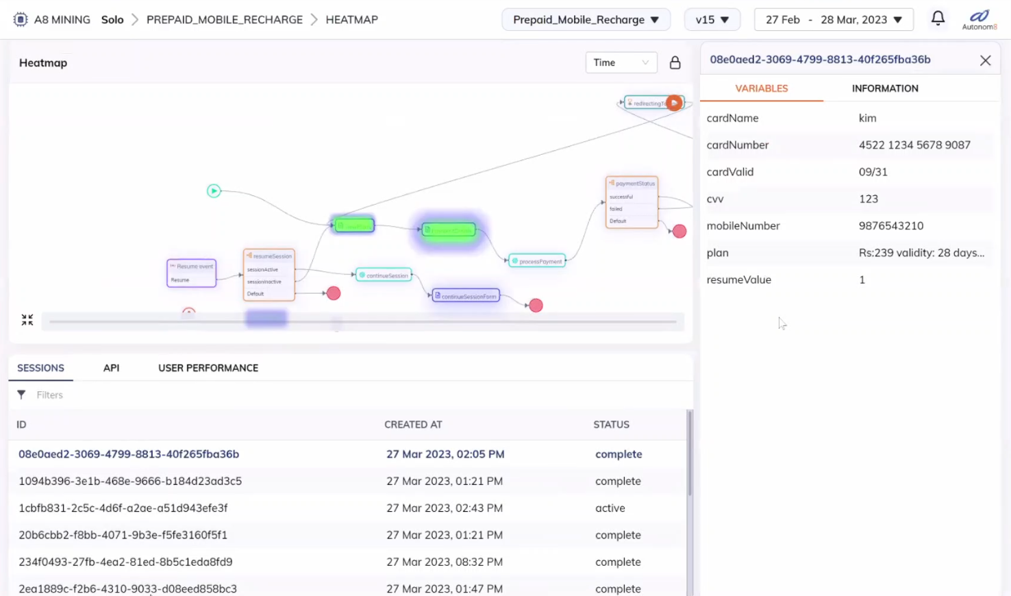
Suppose you want to investigate a specific node further. By clicking on it, a drawer will appear, showing the variables associated with that node. This allows you to inspect the variables and determine if any specific variables are causing delays or issues. The drawer has two tabs: "variables" and "information." The "variables" tab displays the variables, while the "information" tab provides metadata about the session, such as flow name, flow type, update time, etc.
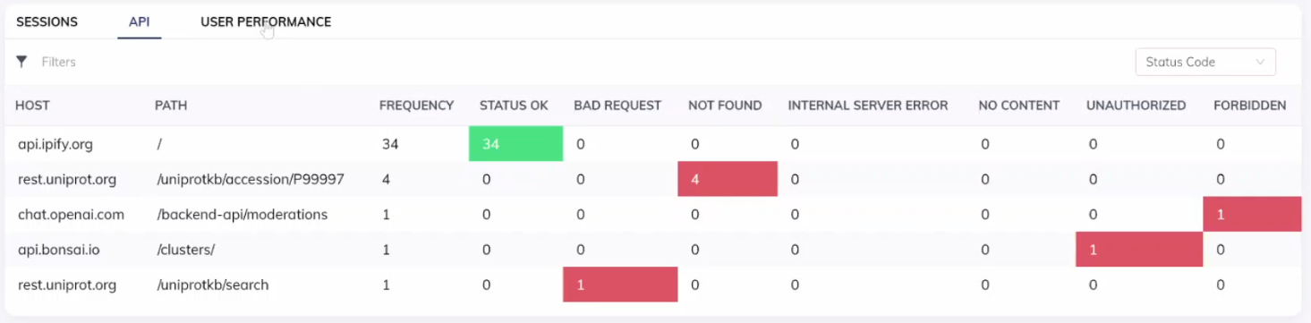
Furthermore, there are two additional tabs: "API" and "User Performance." The "API" tab shows a list of APIs related to the app. The APIs are color-coded based on their status. Green indicates a successful status, while red represents a non-successful status.
The "User Performance" tab displays a list of users, along with their average completion times for nodes and the number of tasks they've completed. Percentiles are also included to give a better understanding of the distribution of completion times.
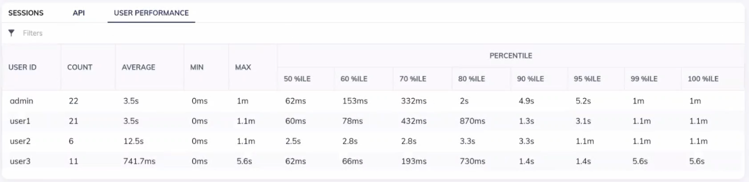
Finally, you can filter the data in both the API and User Performance tabs based on the selected node at the top of the page. This allows you to focus on specific nodes and view the relevant data.
Active Sessions Widget: Monitoring Active Nodes
The Active Sessions widget allows you to monitor and track real-time data on active nodes within a flow, giving you an overview of flow progress.
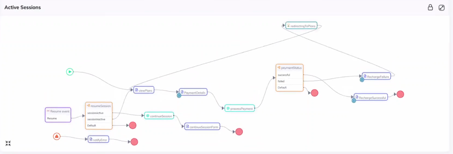
In this widget, you'll find badges indicating the number of active sessions for each node. For example, if a node has two badges, it means there are currently two active sessions in that particular node. The badges help you identify which nodes are active.
Active nodes can be in two states: active state and error state. In the widget, active nodes are represented by blue badges, indicating their active state. On the other hand, if a node encounters an error and gets stuck, the badge for that node will be in red color, representing the error state. This visual distinction helps you quickly identify nodes that require attention.
- Blue Badge (Active Status)
- Red Bade (Error Status)
Similar to expanding the heatmap widget, we can also expand the active sessions widget. By doing so, it will show all the active sessions and their details. You can perform filtering based on different criteria such as user performance, percentiles, and API. Additionally, you can filter sessions based on specific nodes and inspect the variables associated with each session.
Dominant Path Widget: Analyzing Flow Routes
The Dominant Path widget provides valuable insights into the most common paths taken within a flow. This widget visualizes the paths users take to reach the end node in a journey. Since there can be multiple ways to reach the end node, there can also be multiple dominant paths. This information is invaluable for optimizing flows, identifying potential bottlenecks, and improving user experience.
The paths are listed in the dropdown menu from the most dominant to the least dominant. The paths are ranked based on their dominance, which is indicated by the percentage of sessions that follow each path.
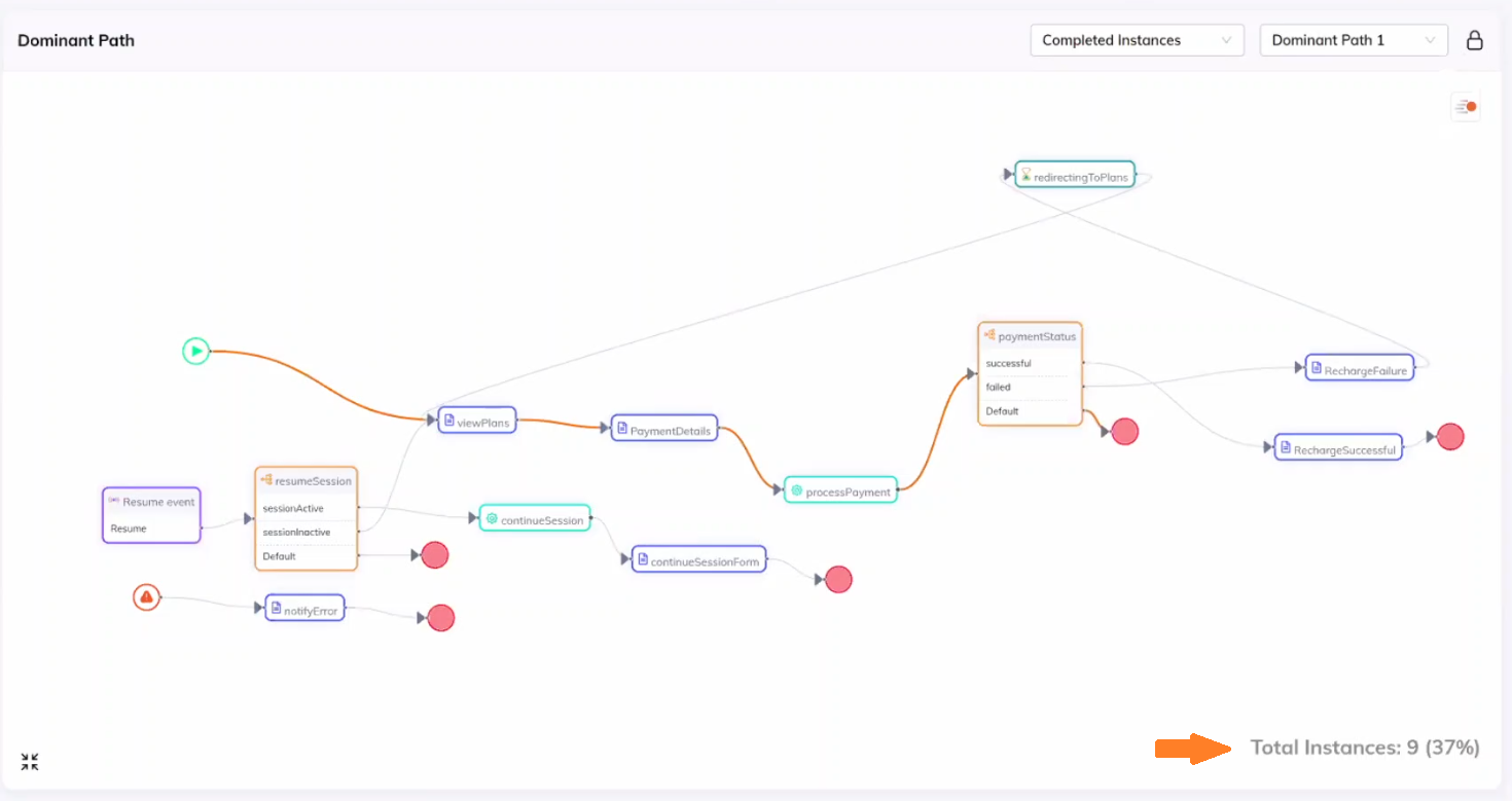
In the widget, you can see that 37% of completed sessions took the most dominant path. By selecting different paths from the drop-down menu, you can observe the flow and the specific nodes that are traversed. The currently selected path is highlighted in orange, while the other paths are dimmed.
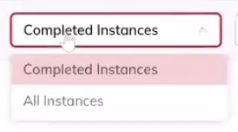
Additionally, you can switch between two different views: "Completed Instances" and "All Instances." "Completed Instances" shows only the dominant paths that have both the start and end nodes, while "All Instances" displays all paths, including incomplete ones. This allows you to focus on either the completed paths or explore the path landscape.
There's also an option to simulate the path using animation. By playing the animation, you can observe how the nodes are traversed. The speed of the bubbles indicates the time taken by each node. Faster bubbles represent shorter completion times, while slower bubbles indicate longer completion times. This visualization helps you understand the flow and identify any delays or bottlenecks in the journey.