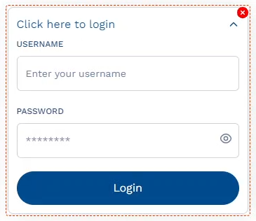
Expansion Panel
The "Expansion Panel" is used for displaying multiple components within a collapsible/expandable container. Ideally used for grouping related elements together and making them more accessible to the users. The header of the Expansion Panel is clickable, which is clicked in order to expand or collapse the panel's content. Similar to a Grid, the Expansion Panel too has layout properties that let you customize the spacing and placement of the components.


API Methods
deleteAsset
Deletes the asset with a specific ID.
- Method
- Usage
deleteAsset(assetInstanceID: string): void
// Deletes the Asset of the following Instance ID: (assetInstanceId).
a8forms.ExpansionPanel("expansionPanelId").deleteAsset("assetInstanceId")
importAsset
Imports the asset with a specific ID.
- Method
- Usage
importAsset(assetId: string, {bindPrefix: string, after?: string}): string
// Imports the Asset of the following ID: (assetId), and assigns a Prefix (bindPrefix) to it (Instance ID).
a8forms.ExpansionPanel("expansionPanelId").importAsset("assetId", {bindPrefix: "bindPrefix"})
setLabel
Sets a Label for the component.
- Method
- Usage
setLabel(label: string): void
// Sets the following Label: (label value here).
a8forms.ExpansionPanel("expansionPanelId").setLabel("label value here")
setReadOnly
Sets the ReadOnly flag for this component.
- Method
- Usage
setReadOnly(readOnly: boolean): void
// Setting the readOnly to "true" renders the field as non-editable
a8forms.ExpansionPanel("expansionPanelId").setReadOnly(true)
// Setting the readOnly to "false" enables the field to be editable
a8forms.ExpansionPanel("expansionPanelId").setReadOnly(false)
setVisibility
Sets the Visibility flag for this component.
- Method
- Usage
setVisibility(visible: boolean): void
// Setting the visibility to "true" makes the element visible
a8forms.ExpansionPanel("expansionPanelId").setVisibility(true)
// Setting the visibility to "false" makes the element invisible
a8forms.ExpansionPanel("expansionPanelId").setVisibility(false)
setVisibilityCondition
Sets the visibility condition for this component.
- Method
- Usage
setVisibilityCondition(condition: string): void
// Sets a condition for changing the element's visibility status.
a8forms.ExpansionPanel("expansionPanelId").setVisibilityCondition("1 === 1")
Event Handlers
Event handlers allow you to set triggers for various actions based on the fired events. They are as follows:
onToggleCollapse
onToggleCollapse - Sets the function to be called whenever the component is toggled between its expanded and collapsed states.