Column
A column component covers a vertical area on the canvas and allows you to add multiple (child) components to it. The area within the column is vertically scrollable - if the no. of (child) components exceed the screen space allotted to the column's vertical area. The screen space occupied by the column can be adjusted in the layout properties section.
Column Layout Properties
The column's layout properties provide most of the component's customization features. Let's take a look at them:
To access the layouts tab, click on the "ruler" icon (last from left) on the top-right of the screen. And make sure the column is the selected component.
| Column Layout | Description |
|---|---|
| Distribute (Left / Right / Center Space Between / Space Evenly / Space Around) | Arranges all components in the column with a single click. Left, Right, & Center: Distributes the components to the Left, Right, or the Center. 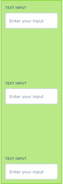 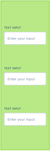  Space Between, Evenly, & Around: Distributes the components vertically with the corresponding space options between and around them. Note: These only reflect if there is enough free space within the column. |
| Align | Similarly, the Alignment property distributes the components horizontally within the column. |
Wrap  | Selecting the "Wrap on overflow" checkbox makes the components move to the next column if they exceed the vertical space of the column.   |
These two layout properties are available only for the Row/Column's (child) components.
Grow - The component's size increases to occupy the maximum available space within the column. Its value in the "Grow" field determines the "ratio" of allocated space (corresponding to the column's other components). Note: The column must have available free space for this to reflect.
Shrink - The size of the component is shrunk with respect to the other components sharing the column space. The value provided in the "Shrink" field determines the ratio.
| Layout Property | Description |
|---|---|
| Span/Row Span (Available only if placed within a grid or directly on the canvas) | The no. of horizontal/vertical cells the column occupies within the said grid/canvas. Note: The "parent" layer must have the appropriate no. of grids/rows. |
| Gap | Sets the space between the individual components within the column. |
| Margin | Sets the space between the column's and the canvas's borders. The checkbox next to this field (if selected) allows you to set the margin thickness on each side individually. |
| Padding | Sets the space between the border's inner-edge and the components within the column. The checkbox next to this field (if selected) allows you to set the padding thickness on each side individually. |
| Horizontal (Left/Center/Right) (Available only if placed within a grid or directly on the canvas) | Sets the horizontal alignment of the component within its occupied cell space. 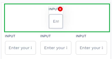 (For components that do not have free cell spaces, the alignment changes do not show.) |
| Vertical (Top/Center/Bottom) (Available only if placed within a grid or directly on the canvas) | Sets the vertical alignment of the component within its occupied cell space. 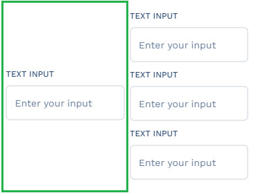 (For components that do not have free cell space, the alignment changes do not show.) |
| Width/Height (%, px, Auto, Max, Min) | Sets the width/height of the component. By default, the maximum width and height are set to 100 % of the cell's dimension it occupies. (Note: The parent grid's configurations determine the cell dimension.) |
| - (Percent) % - | Sets the percentage of space the component will use within the allocated cell (of its "binding parent" container - Canvas/Grid). |
| - (Pixel) px - | Sets the size to the exact pixel specified. |
| - Auto - | Sets the component to occupy a dynamic width or height (ranging from between the "Max" range and the "Min" range) based on the available cell space. (Note: If the Absolute checkbox is selected, then setting to Auto makes the component occupy the entire grid space.) |
| - Max - | Sets the component to occupy 100% of its "default" intrinsic width/height. |
| - Min - | Sets the component to render in its min possible size - determined by the maximum size of the component's wrapped "text" value. |
| Absolute | Unbinds the component from its assigned cell/space and moves it to the "Canvas". Note: When selecting the "Absolute" checkbox, four direction fields (Top, Right, Bottom, and Left) are enabled. Changing the values in these fields (by entering a number or using the up/down arrow keys) controls the position of the component on the canvas - both horizontally and vertically. The values of the Right and Top fields take precedence over the values of the Left and Bottom fields, respectively. Additionally, you can use the Width/Height properties of the component to customize its appearance. |
| Fixed | Sets the component to ignore its assigned cell and grid space/boundaries and attaches itself to the very bottom of the canvas. |
| Border Width | Changes the thickness of the column's borders. |
| Border Radius | Changes the curve-angle of the border's edges. |
| Font Size | Sets the size of the text within the column. |
| Font Weight Range - 100 to 900 (@ increments of 100) | Sets the thickness of the text within the column. |
| Colors | Description |
|---|---|
| Background | Changes the color of the column's background. (Note: To change the color, click on the color strip next to the respective fields. Then select the color of your choice from the color picker tool that pops up.) |
| Color | Changes the color of the column. |
| Border Color | Changes the color of the column's borders. |
Column Properties
The column component features the basic set of widget properties. To access its properties tab, click on the "equalizer" icon (3rd from left) on the top-right of the screen. The Properties tab includes the following options; let’s take a look at them:
ID - A unique alpha-numeric code that’s auto-generated when the component is placed on the canvas.
Visible - A checkbox that lets you show/hide the component on app deployment.
Hide/Show Element - Lets you set the condition to either hide/show the component after app deployment.
Label - Lets you add a "Display Name" to the component.
[Note: Make sure that the column is your currently selected widget]
API Methods
deleteAsset
Deletes the asset with a specific ID.
- Method
- Usage
deleteAsset(assetInstanceID: string): void
// Deletes the Asset of the following Instance ID: (assetInstanceId).
a8forms.Column("columnId").deleteAsset("assetInstanceId")
importAsset
Imports the asset with a specific ID.
- Method
- Usage
importAsset(assetId: string, {bindPrefix: string, after?: string}): string
// Imports the Asset of the following ID: (assetId), and assigns a Prefix (bindPrefix) to it (Instance ID).
a8forms.Column("columnId").importAsset("assetId", {bindPrefix: "bindPrefix"})
setLabel
Sets a Label for the component.
- Method
- Usage
setLabel(label: string): void
// Sets the following Label: (label value here).
a8forms.Column("columnId").setLabel("label value here")
setReadOnly
Sets the ReadOnly flag for this component.
- Method
- Usage
setReadOnly(readOnly: boolean): void
// Setting the readOnly to "true" renders the field as non-editable
a8forms.Column("columnId").setReadOnly(true)
// Setting the readOnly to "false" enables the field to be editable
a8forms.Column("columnId").setReadOnly(false)
setVisibility
Sets the Visibility flag for this component.
- Method
- Usage
setVisibility(visible: boolean): void
// Setting the visibility to "true" makes the element visible
a8forms.Column("columnId").setVisibility(true)
// Setting the visibility to "false" makes the element invisible
a8forms.Column("columnId").setVisibility(false)
setVisibilityCondition
Sets the visibility condition for this component.
- Method
- Usage
setVisibilityCondition(condition: string): void
// Sets a condition for changing the element's visibility status.
a8forms.Column("columnId").setVisibilityCondition("1 === 1")
Event Handlers
Event handlers allow you to set triggers for various actions based on the fired events. They are as follows:
onClick
onClick - Sets the actions to be triggered when the component is clicked.