Spacer (Row/Column)
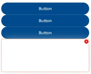
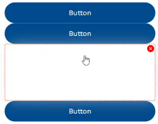
A spacer is an empty component that occupies the corresponding no. of cells assigned to it - this helps you create a blank space between other components. You can use it for separating different elements of the form/app, including entire sections, such as a group of input fields and buttons or other widgets. Overall, the spacer helps you enhance the visual aesthetics of your design and improves the usability of your screen space.
Note: A Row/Column Spacer can be applied only within the Row or Column component.
Row Spacer
Adding the spacer component to a "Row" widget renders a blank space, which can be moved around within the row. Also, it can be customized the same way as any other element, thus giving you more control over the spacing, unlike the row's "Distribute" property.


Column Spacer
Adding the spacer component to a "Column" widget renders the blank space vertically (above/below other elements in the column). It can be slid around to add a customized look to your form/app.

