Divider
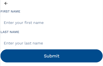
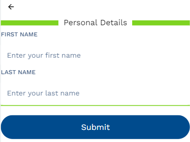
The "Divider" adds a horizontal line, helping you to visually separate multiple components or sections within the form. This line stretches across the width of the application giving the users a cue as to the start or end of the sections. Dividers are ideally used for improving the application's organization and usability by breaking them into smaller sections.
Divider Properties
| Property | Description |
|---|---|
| Text | Adds a text to the mid of the divider, allowing you to enter a title or an end text to the section. |
| Line Height | Sets the thickness of the divider line. |
| Line Color | Changes the color of the divider. |
| Before | After |
|---|---|
 |  |
API Methods
setVisibility
Sets the Visibility flag for this component.
- Method
- Usage
setVisibility(visible: boolean): void
// Setting the visibility to "true" makes the element visible
a8forms.Divider("dividerId").setVisibility(true)
// Setting the visibility to "false" makes the element invisible
a8forms.Divider("dividerId").setVisibility(false)
setVisibilityCondition
Sets the visibility condition for this component.
- Method
- Usage
setVisibilityCondition(condition: string): void
// Sets a condition for changing the element's visibility status.
a8forms.Divider("dividerId").setVisibilityCondition("1 === 1")