Table
Setting Up A Table
A table is an efficient tool for presenting and collecting data. It makes the consumption of information more accessible. The table widget supports the insertion and updation of data from and to a database. It allows cell-highlights on custom conditions, sports auto-refresh with a timer for triggering table updates at regular intervals, and more.

Here, you will learn:
- How to add a table to your form.
- Populate it with custom data.
- Or use API to import data from the database.
- Customize its appearance (like header color, text color, size & weight, highlight or hover color, increase/decrease cell padding, etc.)
- And you will learn the use of its various properties.
Adding a table to your form
This icon on the right panel represents the table widget; it's slotted under the Layouts category. Click and drag it to the canvas to create a new table.

Note: By default, the table comes pre-populated with sample data to give you the feel of its layout.
Adding data to the table
There are two methods for adding custom data to the table; they are as follows:
- onPreload
- onClick
onPreload
The "onPreLoad" feature is available under the "Data" tab. *It's the 2nd from left on the bottom-right of the screen
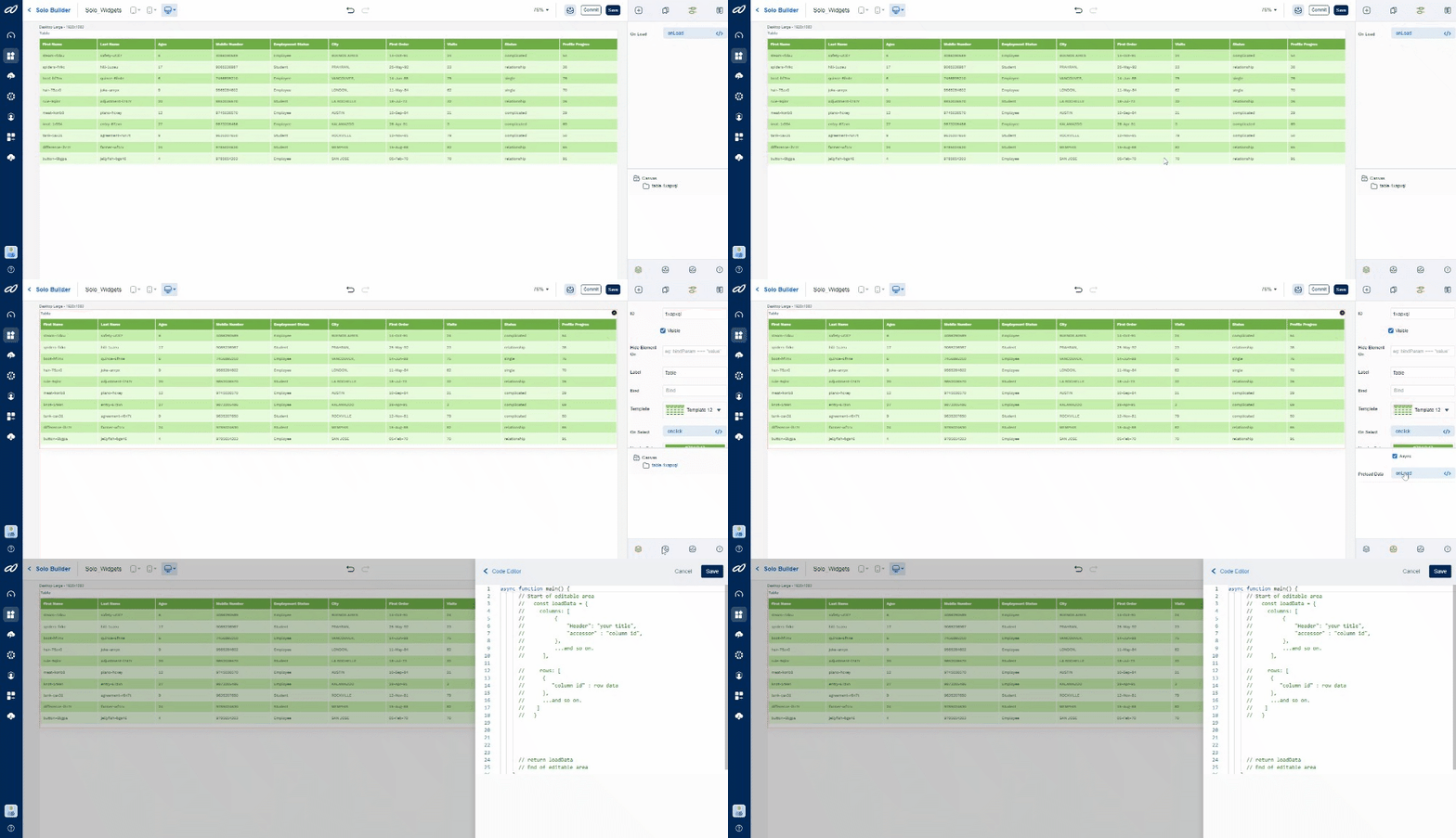
[Make sure that the table is your currently selected widget]
Select the data icon.
Click
onPreLoadto open the "Code Editor" window. (Note: Can't see the "onPreLoad" button? Ensure you have selected the 'Async' checkbox.)
Now, on the Code Editor screen, use the following script to add your custom data.
- onPreload: Syntax
- Static
- Dynamic
async function main() {
  // Start of editable area
  const loadData = {
    columns: [
      {
        "Header": "your title",
        "accessor": "column id",
      },
      ...and so on.
           ],

    rows: [
      {
        "column id": row data
      },
      ...and so on.
         ]
  }
  return loadData
  // End of editable area
}
async function main() {
  // Start of editable area
  const dColumns = [
    {
      Header: "First Name",
      accessor: "firstName",
      format: "string"
    },
    {
      Header: "Last Name",
      accessor: "lastName",
      format: "string"
    },
    {
      Header: "Mobile Number",
      accessor: "mobileNumber",
      format: "number"
    },
  ]
  const dRows = [
    {
      "firstName": "steam-rldau",
      "lastName": "safety-ut3l7",
      "mobileNumber": 4086290589,
    },
    {
      "firstName": "spiders-firkc",
      "lastName": "hill-1uzeu",
      "mobileNumber": 9065236987,
    },
    {
      "firstName": "boot-hf7nx",
      "lastName": "quince-6fn4e",
      "mobileNumber": 7456895210,
    },
  ]
  // End of editable area
}
async function main() {
  // Start of editable area
const loadData = {
    columns: [],
    rows: []
  }
  let code = "SBIN00CARDS"
  let result = await axios.get(`https://ifsc.razorpay.com/${code}`)

// Change the following variables as per your API-specific "result".

  if (result) {
    Object.keys(result?.data).map((items) => {
      let colData = {
        "Header": items,
        "accessor": items,
        "format": "string"
      }
      loadData.columns.push(colData)

    })
    loadData.rows.push(result.data)
  }
  return loadData;
  // End of editable area
}
onClick
You can also use the “onClick” feature of other widgets (such as buttons) to populate the table. Use the following script on the Code Editor screen of the widget to add your custom data.
- onClick: Syntax
- Static
- Dynamic
a8forms.Table("table id").setData({
    columns: [
      {
        "Header": "your title",
        "accessor": "column id",
      },
      ...and so on.
           ],

    rows: [
      {
        "column id": row data
      },
      ...and so on.
         ]
  })
async function main() {
  // Start of editable area

a8forms.Table("1wrvku2").setData({
  // Here, "1wrvku2" is the "table id" - replace it with your table's respective id.

    columns: [
      {
      Header: "First Name",
      accessor: "firstName",
      format: "string"
    },
    {
      Header: "Last Name",
      accessor: "lastName",
      format: "string"
    },
    {
      Header: "Mobile Number",
      accessor: "mobileNumber",
      format: "number"
    },
    ],
    rows: [
      {
      "firstName": "steam-rldau",
      "lastName": "safety-ut3l7",
      "mobileNumber": 4086290589,
    },
    {
      "firstName": "spiders-firkc",
      "lastName": "hill-1uzeu",
      "mobileNumber": 9065236987,
    },
    {
      "firstName": "boot-hf7nx",
      "lastName": "quince-6fn4e",
      "mobileNumber": 7456895210,
    },
    ]
  })
  // End of editable area
}
async function main() {
  // Start of editable area
  const loadData = {
    columns: [],
    rows: []
  }
  let code = "SBIN00CARDS"
  let result = await axios.get(`https://ifsc.razorpay.com/${code}`)

  // Change the following variables as per your API-specific "result".

  if (result) {
    Object.keys(result?.data).map((items) => {
      let colData = {
        "Header": items,
        "accessor": items,
        "format": "string"
      }
      loadData.columns.push(colData)

    })
    loadData.rows.push(result.data)
  }

  // The following script loads the data from the API to the table.
  a8forms.Table("1wrvku2").setData(loadData)
  // Here, "1wrvku2" is the "table id" - replace it with your table's respective id.

  // End of editable area
}
Now that your table is populated, let's customize its appearance.
Table Properties
The table features extensively configurable properties, enabling you to create a specific-looking or functioning table. To access the properties tab, click on the "equalizer" icon (3rd from left) on the top-right of the screen.

[Note: Make sure that the table is your currently selected widget]
So, the Properties tab includes a variety of options. Let’s take a look at them:
ID - A unique alpha-numeric code that’s auto-generated when the component is placed on the canvas.
Visible - A checkbox that lets you show/hide the component on app deployment.
Hide/Show Element - Lets you set the condition to either hide/show the component after app deployment.
Label - Display name of the component on the app.
Bind - (…link to the bind page)
Table Customization
Pre-built Templates
To begin with, we offer a distinct set of templates featuring a variety of grid & color presets, which you can pick on the fly to quickly customize the look of your table.
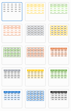
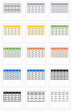
Of course, you can further change these visual aspects via the following fields:
Changing the Color, Font Size / Weight, and more
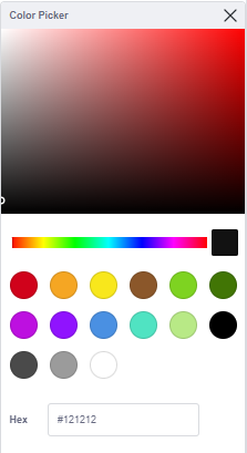
To change the color, click on the color strip next to the respective fields. Then select the color of your choice from the color picker tool that pops up.
| Feature | Description |
|---|---|
| - Header Color | Changes the color of the table’s header section. |
| - Header/Cell Text Color | Changes the font color of the text in the header/cells respectively. |
| - Header/Cell Font Size | Changes the font size of the text in the header/cells respectively. |
| - Header/Cell Font Weight | Changes the font-thickness of the text in the header/cells respectively. |
| - Row Even/Odd Color | Changes the color of the even/odd rows. |
| - Selection Color | Changes the color of the selected row. |
| - Hover Color | Changes the color of the row on mouseover.  |
| - Row and Column Size (Width/Height) | Changes the width/height of the columns and rows across the table. |
| - Cell Padding | Changes the padding around the text within each cell. 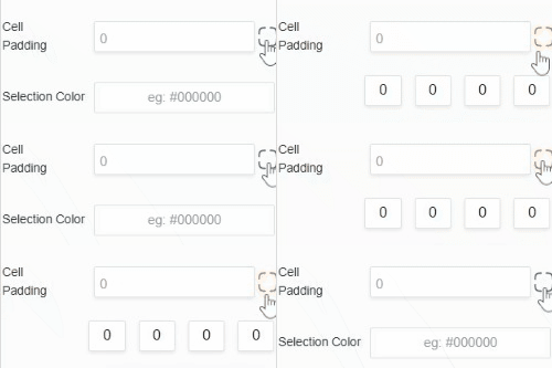 (Note: This value changes padding on all sides of the cell. To work on each side individually, click the checkbox-like button next to the field. Now, you can change the padding on specific sides of the cell -- starting from the top and going clockwise.) |
Fixed Columns (Left / Right)
Freezes the column either to the left or right of the screen.
Enter the Col-ID of the column you want to freeze (you can add more than one column to the list). By default, the left-side freezing is selected.
To change it to the right side, click on the drop-down next to the text field and select the appropriate side. Now, enter the Col-ID to have that column frozen to the right.
Note: You can freeze the column to only one side of the screen; by adding it to both sides, you will effectively overwrite one of them.
Column Alignments (Left / Center / Right)
Changes the alignment of the text within the cells of a column.
Left Alignment - By default, all columns are left-aligned.
Center/Right Alignment - Add the Col-ID of the particular column to either of these alignment options. Use the drop-down list to change the alignment side.
Cell Highlighting
Allows "highlighting" of a particular column/cell based on your given condition. Ideal when the cells need a dynamic color change.
[Scenario: A stock sheet that highlights corresponding cells in green or red based on the stock's performance -- green when it rises beyond a certain threshold and red when it falls.]
To create a condition:
Click the
Addbutton.Fill in the following fields.
Col-ID -> Type in the ID of the column you want to highlight.
Expression -> Sets the condition for highlighting the field.
| Name | Expression |
|---|---|
| Either (Or) | {value} === 24 // {value} === 22 |
| AND | {value} === 24 && {value} === 22 |
| Dynamic | {value} === $ {input bind} |
Background Color -> Sets the background color for the highlighted field.
Text Color -> Sets the text color for the highlighted field.
- Click on
Submitto confirm changes orCancelto reject changes.
Note: There can be multiple conditions within a table.
Auto Refresh
Refreshes the table on a set timer.
Note: 5 seconds is the minimum possible period.
Enable Editing
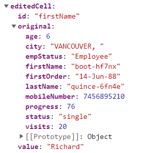
By enabling the editing option for the table, you allow the users to make changes to the text in the cells. Enable Editing is set to "ON" by a toggle button. In doing so, you also enable the following Event Handlers.
Selected Cell - lets you get/read the selected cell's data. Used similarly to the "onSelect" row field.
onChange - lets you get/read the selected cell's edited data.
[Scenario: Ideal for updating the original database with the "New" data]
API Methods
setVisibility
Sets the Visibility flag for this component.
- Method
- Usage
setVisibility(visible: boolean): void
// Setting the visibility to "true" makes the element visible
a8forms.Table("tableID").setVisibility(true)
// Setting the visibility to "false" makes the element invisible
a8forms.Table("tableID").setVisibility(false)
setVisibilityCondition
Sets the visibility condition for this component.
- Method
- Usage
setVisibilityCondition(condition: string): void
// Sets a condition for changing the element's visibility status.
a8forms.Table("tableID").setVisibilityCondition("1 === 1")
Event Handler
onSelect
onSelect - It lets you get/read the selected row's data, which is ideal for when you want to use it for pushing the data onto a text field.
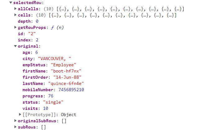
[example: To get the data under First Name, Last Name, Age, and Mobile Number and display it under their respective text fields]
async function main(selectedRow) {
    // Start of editable area
    setBindParams("firstName", selectedRow.original.firstName) || setBindParams("firstName", selectedRow.values.firstName)
// original (or) values: One of the keys within the props(selectedRow).

// "firstName": A "bind" of the input-field -- to where you will push the "value".
// selectedRow: Props of the "main" function.
// firstName: A "key" within either original (or) values -- holds the "value" (firstName) of the selected row.

    setBindParams("lastName", selectedRow.original.lastName)
    setBindParams("age", selectedRow.original.age)
    setBindParams("mobileNum", selectedRow.original.mobileNumber)
    // End of editable area
}