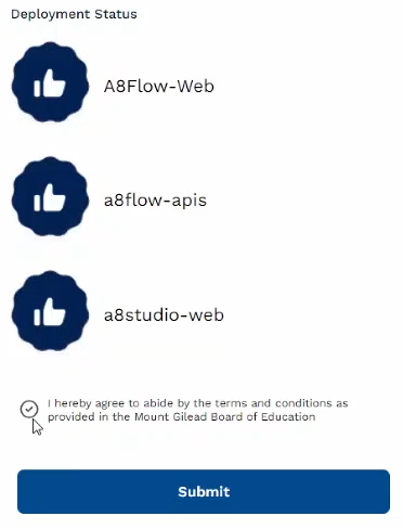
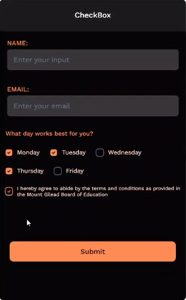
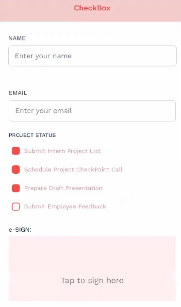
CheckBox
The "CheckBox" widget is used when the user should be selecting one or more options from a list of choices you offer. It is displayed as a box (or circle) that can be checked or unchecked to indicate the selection status.
| 01 | 02 | 03 | 04 |
|---|---|---|---|
 |  |  |  |
Checkbox Properties
| Property | Description |
|---|---|
| Direction (Vertical/Horizontal) | Sets the direction of display for the checkboxes. |
| Selected / Unselected [Tabs] | Switch between the properties associated with the Selected or Unselected options. |
| Icon With URL [Checkbox] | Enables you to set an icon as the (un)selected checkboxes. |
| Icon URL | Enter the URL of the icon here. |
Shape | Select one of the available shapes for the checkboxes. |
| Border Color | Sets the border color of the checkboxes. |
| Fill Color | Sets the background color of the checkboxes. |
| Font Size | Sets the size of the text. |
| Font Weight | Sets the thickness of the text. |
| Color | Sets the color of the text. |
Adding Data to the List
There are three ways to add "Data" to the Checkbox component, they are as follows:
- Direct - Manually entering the data
- Static - Hardcoding the data
- Dynamic - Using API to source external-data
Direct Method
To add custom data directly to the checkbox list.
Step 01 Click on the data icon.
*It's the 2nd from left on the bottom-right of the screen
Step 02 Enter the desired display name in the "label" field and the corresponding bind name in the "value" field.
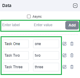
Step 03 Click the "Add" button.
onPreload
The "onPreLoad" feature is available under the "Data" tab. [Make sure that the checkbox is your currently selected widget]
Step 01. Select the data icon.
Step 02 Click onPreoad to open the "Code Editor" window. (Note: Ensure that you have selected the 'Async' checkbox.)

Now, on the Code Editor screen, use the following script to add your custom data.
- onPreload: Syntax
- Static (Hardcoded)
- Dynamic (API)
async function main(asset) {
//   const option = { label: '', value: '' }
//   const returnValue = [option, option]

//   return array of options(s) to populate checkbox
}
async function main(asset) {
  // Start of editable area

  const data = [
    { label: "Amount: 5000", value: 5000 },
    { label: "Amount: 10000", value: 1000 },
    { label: "Amount: 15000", value: 15000 },
  ]
  return data
  // End of editable area
}
async function main(asset) {
  // Start of editable area

  const res = await fetch('https://jsonplaceholder.typicode.com/todos')
  const data = await res.json()
  const todos = data.slice(0, 5).map(item => ({ value: item.userId, label: item.title }))

  return todos
  // End of editable area
}
onClick
You can also use the “onClick” feature of other widgets (such as buttons) to populate the checkbox list. Use the following script on the Code Editor screen of the widget to add your custom data.
- onClick: Syntax
- Static (Hardcoded)
- Dynamic (API)
async function main(asset) {
  // const option = { label: '', value: '' }
  // const data = [option, option]

  a8forms.CheckBox("checkBoxID").setData(data)
}
async function main(asset) {

  const data = [
    { label: "Amount: 5000", value: 5000 },
    { label: "Amount: 10000", value: 1000 },
    { label: "Amount: 15000", value: 15000 },
  ]
  a8forms.CheckBox("checkBoxID").setData(data)

}
async function main(asset) {

  const res = await fetch('https://jsonplaceholder.typicode.com/todos')
  const data = await res.json()
  const todos = data.slice(0, 5).map(item => ({ value: item.userId, label: item.title }))
  a8forms.CheckBox("checkBoxID").setData(todos)

}
API Methods
setData
Adds the specified set of "Data" to the component.
- Method
- Usage
setData(data: {label: string, value: string}[]): void
// Sets the following "key" & "value" pairs as your Checkbox's list.
a8forms.CheckBox("checkBoxID").setData([
    { label: "Task One", value: "one" },
    { label: "Task Two", value: "two" },
    { label: "Task Three", value: "three" },
  ])
setProperties
Sets the different "property" of the checkbox widget.
- Method
- Usage
setProperties(data: {label: string, value: string}[]): void
a8forms.CheckBox("checkBoxID").setProperties([
    "backgroundColor": "#E0D993",
    "border": "1",
    "borderColor": "",
    "borderRadius": 3,
    "color": "#119c80",
    "fontSize": 12,
    "fontWeight": 600,
    "selectedBorderColor": "#7D1892", "unSelectedBorderColor": "#DDCCEA",
  ])
setReadOnly
Sets the ReadOnly flag for this component.
- Method
- Usage
setReadOnly(readOnly: boolean): void
// Setting the readOnly to "true" renders the field as non-editable
a8forms.CheckBox("checkBoxID").setReadOnly(true)
// Setting the readOnly to "false" enables the field to be editable
a8forms.CheckBox("checkBoxID").setReadOnly(false)
setVisibility
Sets the Visibility flag for this component.
- Method
- Usage
setVisibility(visible: boolean): void
// Setting the visibility to "true" makes the element visible
a8forms.CheckBox("checkBoxID").setVisibility(true)
// Setting the visibility to "false" makes the element invisible
a8forms.CheckBox("checkBoxID").setVisibility(false)
setVisibilityCondition
Sets the visibility condition for this component.
- Method
- Usage
setVisibilityCondition(condition: string): void
// Sets a condition for changing the element's visibility status.
a8forms.CheckBox("checkBoxID").setVisibilityCondition("1 === 1")
Event Handlers
onChange
onChange - Triggers a specified action every time there's a change to the component's "value".