Date Input
The "Date Input" field allows users to manually enter the date in a specific (DD/MM/YYYY) format. It's ideal for use in applications where a date needs to be entered, such as a DOB field in a form.
Following are the "Date Input" properties:
Date Input Properties
| Property | Description | (Checked) | (Unchecked) |
|---|---|---|---|
| Guided Input (Checkbox) | Adds subtle underscores to indicate the number of characters that can be entered. |  |  |
| Keep Char Positions (Checkbox) | Once entered, the characters remain fixed to their positions. | 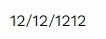 | 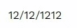 |
API Methods
setReadOnly
Sets the ReadOnly flag for this component.
- Method
- Usage
setReadOnly(readOnly: boolean): void
// Setting the readOnly to "true" renders the field as non-editable
a8forms.DateInput("dateInputId").setReadOnly(true)
// Setting the readOnly to "false" enables the field to be editable
a8forms.DateInput("dateInputId").setReadOnly(false)
setVisibility
Sets the Visibility flag for this component.
- Method
- Usage
setVisibility(visible: boolean): void
// Setting the visibility to "true" makes the element visible
a8forms.DateInput("dateInputId").setVisibility(true)
// Setting the visibility to "false" makes the element invisible
a8forms.DateInput("dateInputId").setVisibility(false)
setVisibilityCondition
Sets the visibility condition for this component.
- Method
- Usage
setVisibilityCondition(condition: string): void
// Sets a condition for changing the element's visibility status.
a8forms.DateInput("dateInputId").setVisibilityCondition("1 === 1")
Event Handlers
Event handlers allow you to set triggers for various actions based on the fired events. They are as follows:
onChange
onChange - Triggers a specified action every time there's a change to the component's "value".