Tag
The "Tag" widget is an interface element that displays a list of tags, typically used for representing categories, keywords, etc. It allows users to select tags from a pre-defined list and also allows them to add new tags by typing them in.
Features
Free Text
On keeping it checked, you allow the users to create custom tags (by typing into the field). This method allows no pre-defined tags to be displayed.

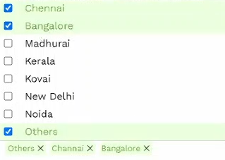
To offer only pre-defined tags for the users, uncheck the "Free Text" checkbox. And the following choices should open up.
Selection Type (List/Drop Down)
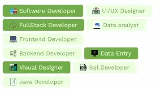
There are two styles for displaying your pre-defined tags: "List" and "Drop Down".
| List | Drop Down |
|---|---|
 |  |
Creating Pre-Defined Tags
To create a set of pre-defined tags:
- Get to the "Data" section of your tags widget.
- Ensure the Async checkbox is unchecked.
- Fill in the respective fields with the Key, Value details (and the URL to add an icon to the tag).
And after adding multiple tags, you should see this.

Tag Properties
These properties control the overall appearance and function of the Tags.
| Property | Description |
|---|---|
| Max Tags | Sets the maximum no. of tags that will be displayed. If set to "3", it displays as follows.  |
| Max Selection | Set the maximum no. of tags that can be selected. |
| Text Color | Changes the color of the text within the tags. |
| Background Color | Changes the color of the tag. |
| Font Size | Changes the font size of the text within the tags. |
| Font Weight | Sets the thickness of the tag texts. |
| Padding (All sides/Individual sides) | Sets the padding within the tags. |
| Tag Spacing | Sets the space between the displayed tags. |
| Tag Border Width | Sets the thickness of the tags' borders. |
| Tag Border Color | Sets the color of the tags' borders. |
| Tag Border Radius | Changes the curve angle of the tags' borders. If set to "20", it shows as follows:  |
| Border Radius | Changes the curve angle of the tag container. If set to "20", it shows as follows:  |
| Border Width | Sets the thickness of the container's borders. |
| Border Color | Sets the color of the container's borders. |
| Clear All | Adds a "Clear All" button to the tag selection container. Clicking it will quickly unselect all the selected tags. |
| Select All (Available only when "Free Text" is unchecked) | Adds a "Select All" button to the tag selection container. Clicking it will quickly select all the unselected tags. |
Event Handlers
Event handlers allow you to set triggers for various actions based on the fired events. They are as follows:
onChange
onChange - Triggers a specified action every time there's a change to the component's "value".