Date Picker
The "Date Picker" allows users to select a date directly from the calendar. It initially highlights the current date, and users can navigate to other days, months, or years to select a specific date. The date picker improves the user experience by making it easier and quicker to select a date. It reduces errors and inconsistencies in date formatting. Also, it allows you to enter the date manually (in a specific format).
Date Picker Properties
| Property | Description |
|---|---|
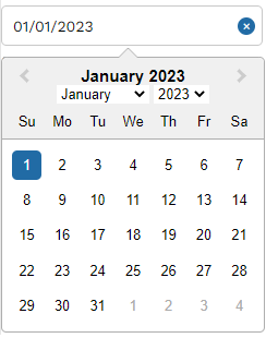
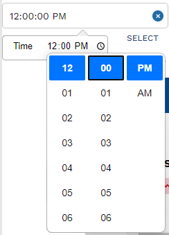
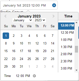
| Type (Date/Time/Date & Time) | Choose between the Date, Time, or Date & Time options. |
| Format (Dropdown) | Set the display format for the selected "Type". |
| Date | Time | Date & TIme |
|---|---|---|
 |  |  |
API Methods
setReadOnly
Sets the ReadOnly flag for this component.
- Method
- Usage
setReadOnly(readOnly: boolean): void
// Setting the readOnly to "true" renders the field as non-editable
a8forms.Datepicker("datePickerId").setReadOnly(true)
// Setting the readOnly to "false" enables the field to be editable
a8forms.Datepicker("datePickerId").setReadOnly(false)
setVisibility
Sets the Visibility flag for this component.
- Method
- Usage
setVisibility(visible: boolean): void
// Setting the visibility to "true" makes the element visible
a8forms.Datepicker("datePickerId").setVisibility(true)
// Setting the visibility to "false" makes the element invisible
a8forms.Datepicker("datePickerId").setVisibility(false)
setVisibilityCondition
Sets the visibility condition for this component.
- Method
- Usage
setVisibilityCondition(condition: string): void
// Sets a condition for changing the element's visibility status.
a8forms.Datepicker("datePickerId").setVisibilityCondition("1 === 1")
Event Handlers
Event handlers allow you to set triggers for various actions based on the fired events. They are as follows:
onChange
onChange - Triggers a specified action every time there's a change to the component's "value".