Modal
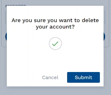
The "Modal" is used to display content or options in a pop-up window that temporarily overlays the main content of a web or mobile application. They are ideally used when you have to provide some additional information, bring attention to something, prompt for input, or require a confirmatory action. The Modal can include animations or transition effects to make it more visually appealing and to guide the user's attention.

Modal Properties
| Property | Description |
|---|---|
| Width | Sets the width of the modal shell. |
| Height | Sets the height of the modal shell. |
| Modal Overlay | Makes the background opaque and sets its color. |
| Header Image | Adds an image (in the URL) to the header section of the modal. |
| Ok Text | Sets the text that's displayed on the "Ok" button. |
| Cancel Text | Sets the text that's displayed on the "Cancel" button. |
| Closable (Checkbox) | Enables the users to close the modal overlay. |
| Footer (Checkbox) | Enables the footer section (Cancel & Submit buttons). |
| Disable Footer Cancel (Checkbox) | Disables the "Cancel" button. |
| Footer Alignment [Left/Center/Right] | Sets the alignment of the footer section. |
| Footer Type [Buttom/Link] | Changes the style of the footer. |
| Select Content Type (Drop-down) | Select the content "Type" that will be displayed on the modal's main section. (Text, Icon, Input, & Image) |
Select Content Type - Properties
| Text Property | Description |
|---|---|
| Content | Enter the text that will be displayed on the modal's main section. |
| Font Wight | Sets the thickness of the text. |
| Font Size | Sets the size of the text. |
| Color | Sets the color of the display text. |
| Margin | Sets the margin around the display text. |
| Text Align | Sets the alignment of the display text. |
| Icon Property | Description |
|---|---|
| Select Icon Variant (Success/Error/Spinner) | Choose between the three available icon variants. |
| Margin | Sets the margin around the displayed icon. |
| Input Property | Description |
|---|---|
| Name | Assign a name to the input field. |
| Label | Adds the title of the input field. |
| Placeholder | Enter the placeholder text displayed within the input field. |
| Margin | Sets the margin around the input field. |
| Image Property | Description |
|---|---|
| Image URL | Add the URL of the image that will be displayed on the modal's main section. |
| Width | Sets the width of the image. |
| Height | Sets the height of the image. |
| Margin | Sets the margin around the image. |
API Methods
Input
Sets the criteria for validating the input fields assigned to the modal component; displays an error message if it fails.
- Method
- Usage
Input(inputId: string).setError(errorMsg: string): void
// Validates the input field (inputName); displays the error message (Error text!) on validation fail.
a8forms.Modal("modalId").Input("inputName").setError("Error text!")
hide
Hides the component.
- Method
- Usage
hide(): void
// Hides the modal with the following ID: (modalID).
a8forms.Modal("modalID").hide()
show
Shows the component.
- Method
- Usage
show(): void
// Shows the modal with the following ID: (modalID).
a8forms.Modal("modalID").show()
setVisibility
Sets the Visibility flag for this component.
- Method
- Usage
setVisibility(visible: boolean): void
// Setting the visibility to "true" makes the element visible
a8forms.Modal("modalId").setVisibility(true)
// Setting the visibility to "false" makes the element invisible
a8forms.Modal("modalId").setVisibility(false)
setVisibilityCondition
Sets the visibility condition for this component.
- Method
- Usage
setVisibilityCondition(condition: string): void
// Sets a condition for changing the element's visibility status.
a8forms.Modal("modalId").setVisibilityCondition("1 === 1")
Event Handlers
Event handlers allow you to set triggers for various actions based on the fired events. They are as follows:
onOk
onOk - Sets the necessary action to be performed when the "OK" button is clicked.
onCancel
onCancel - Specifies the action to be taken when the user clicks the "Cancel" button to dismiss a dialog or cancel an action.