SignaturePad
The "SignaturePad" widget allows users to sign digitally - they will be able to use a mouse, stylus, or finger on a touchscreen device to draw their signature. It captures the signature as an image file which is then stored within the applications.
| - | - | - | - |
|---|---|---|---|
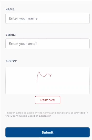 | 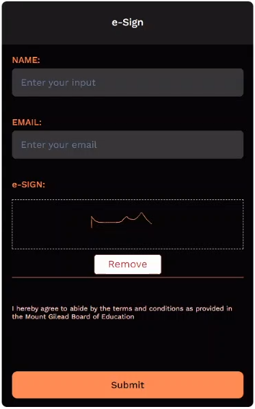 | 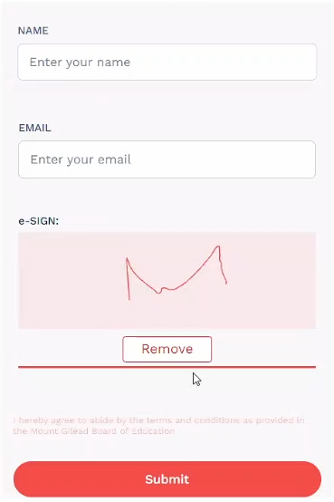 | 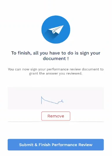 |
SignaturePad Properties
These are the basic properties of the SignaturePad widget. To access the properties tab, click on the "equalizer" icon (3rd from left) on the top-right of the screen. Now, let’s take a look at the features available in the Properties tab:
ID - A unique alpha-numeric code that’s auto-generated when the component is placed on the canvas.
Visible - A checkbox that lets you show/hide the component on app deployment.
Hide/Show Element - Lets you set the condition to either hide/show the component after app deployment.
Label - Display the name of the component on the app.
Bind - (…link to the bind page)
Placeholder - Text that's usually displayed within the widget's text area - ideally to guide the users with examples or a brief of the widget.
Style Properties
| Property | Description |
|---|---|
| Stroke Width (Min/Max) | Sets the minimum and maximum thickness of the strokes (lines). |
| Dot Size | Its the no. of pixels a single dot occupies (a mouse click). |
| Stroke Color | Sets the color of the stroke. |
| Border Style (Solid/Dashed) | Choose between a "Solid" and a "Dashed" border. |
| Actions (Save/Clear/Remove) | Save: Saves the signature to a bind in an image format. Clear: Clears the signature from the screen; however, the signature stored in a bind is not. Remove: The signature is cleared from the screen and its bind. |
Action Properties
The actions mentioned above (save, clear, and remove) have separate buttons assigned to them. These buttons feature a set of "properties" that let you customize their appearance - which are as follows:
| Action Property | Description |
|---|---|
| Text Color | Sets the color of the text. |
| Border Radius | Changes the curve-angle of the border's edges. |
| Border Width | Changes the thickness of the border. |
| Border Color | Sets the color of the border. |
| Background | Sets the background color of the widget. |
Using the Signature Pad
| Step 01 | Step 02 | Step 03 |
|---|---|---|
Tap on the Signature Pad to open the "Signing" area. 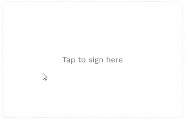 | (The signing area) Sign here. 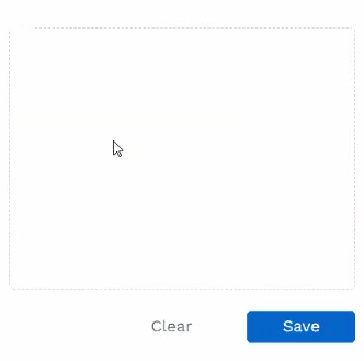 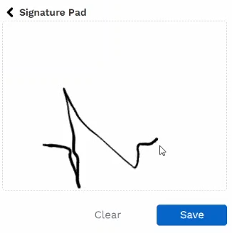 | You have two options (Clear/Save). Clear: Clears the "signing area" so you can start over. Save: When you are satisfied with the "sign" and want to proceed with it. [Note: The sign is saved to a BindParams, in an image format.] |
| - | Step 04 (Optional) | Note! |
The next page displays the selected sign. 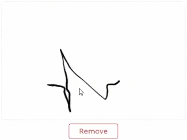 | Suppose you change your mind about the selected sign and want to retry. | On clicking "Remove", the process restarts back from Step 01. |